CardFinder (2024)

Executive Summary
Problem:
Users struggled to confidently choose a credit card due to product complexity, perceived bias, and decision fatigue.
Context:
CardFinder sat at the intersection of editorial trust, personalization, and affiliate monetization, making recommendation quality and transparency business-critical.
My Role:
Senior Product Designer leading UX strategy and end-to-end experience design in close partnership with Product, Engineering, Content, and Legal.
Outcome:
Launched a scalable recommendation experience that reduced decision anxiety, increased qualified engagement with reviews, and preserved long-term trust.
Problem & Business Context
NerdWallet’s credit card ecosystem relied heavily on editorial reviews and comparison pages, but many users still felt overwhelmed deciding where to start.
CardFinder was designed to:
Reduce decision paralysis
Help users narrow options quickly
Route users into high-intent editorial content
From a business perspective, it needed to drive monetization without compromising credibility; a non-negotiable constraint.
Why This Was Hard
Key challenges included:
Trust vs. optimization: recommendations could not feel biased or sales-driven
Explainability: users needed to understand why cards were shown
System constraints: only fully reviewed, editorially approved cards were eligible
Scale: the solution needed to work across many card categories and future products
Over-optimizing for conversion risked long-term brand trust.
Approach & Strategy
Rather than building an opaque “best card” engine, we focused on guided clarity.
Design principles:
Trust over persuasion
Progressive disclosure
Explainable recommendations
Optional depth for cautious users
The goal was not to decide for users—but to help them decide confidently.
Design Solution
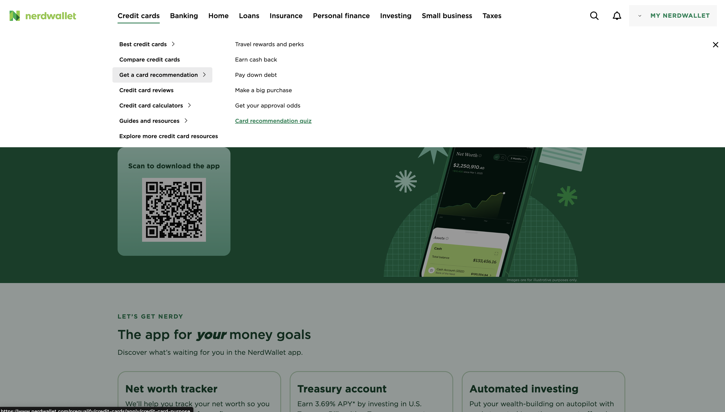
CardFinder is a guided recommendation flow, not a one-click decision tool.
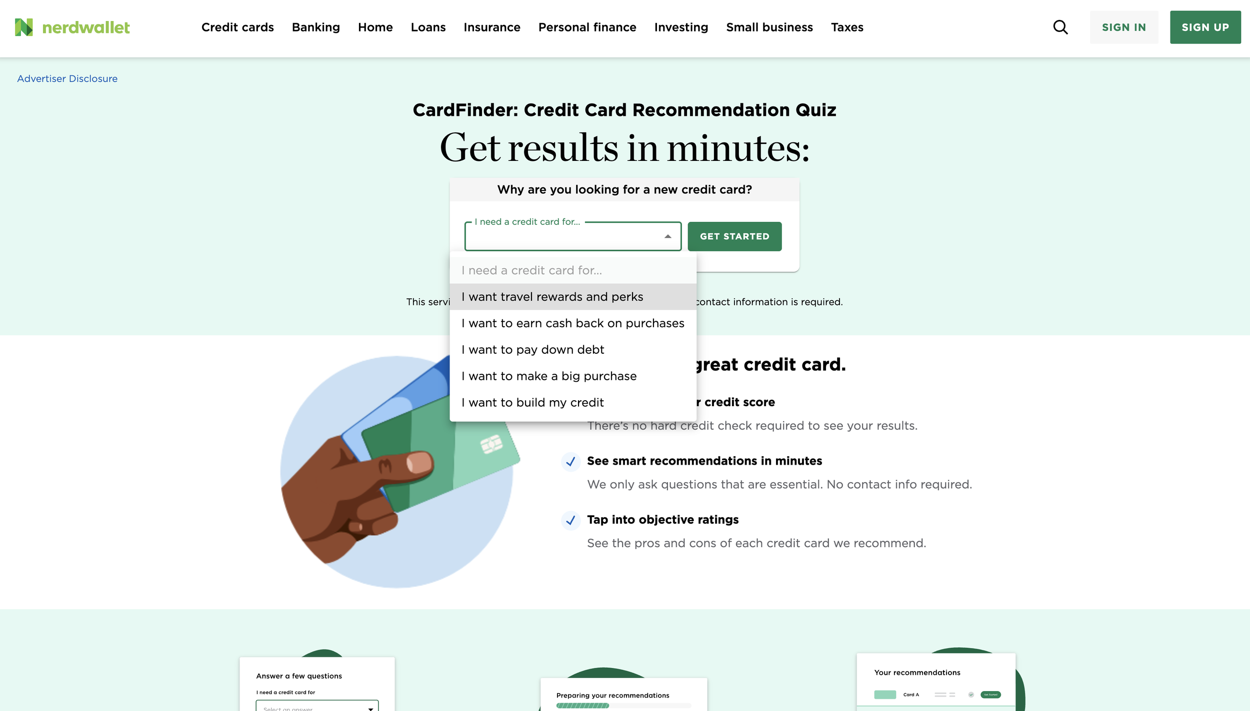
Quiz Experience
5–7 lightweight, goal-based questions
Focused on intent and preferences, not sensitive data
Designed to feel conversational and fast
Recommendation Model (UX Layer)
Hard eligibility filters
Soft scoring across rewards, fees, and use cases
Editorial approval as a gating requirement
Sponsored relationships never overrode relevance.
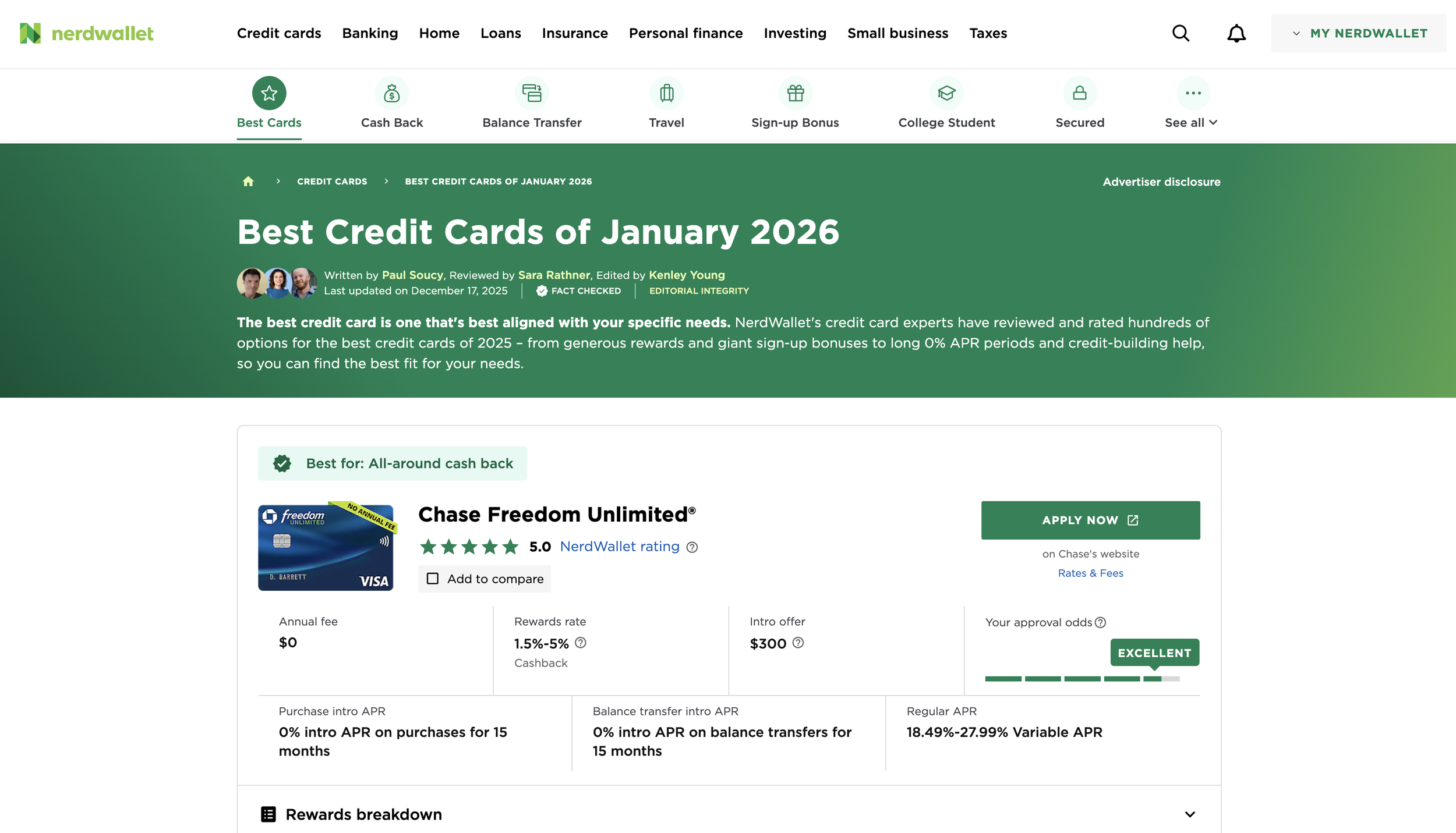
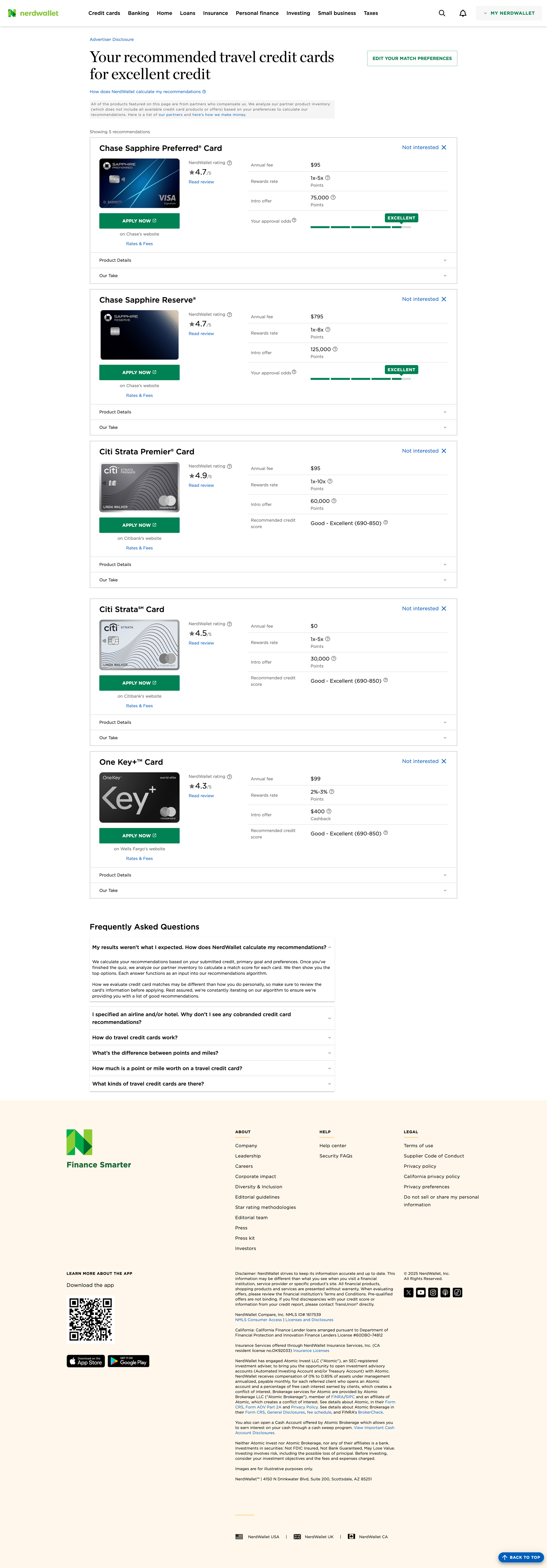
Results Experience
The results page functioned as the primary trust moment:
3–5 strong options instead of a single “winner”
Clear explanations for why each card matched
Balanced pros and cons
Direct paths into full editorial reviews
We intentionally avoided urgency language or aggressive CTAs.
Impact & Outcomes
Post-launch iteration showed:
Higher quiz completion rates
Deeper engagement with review content
Improved downstream conversion despite fewer hard pushes
Strong qualitative trust feedback
CardFinder became a foundational discovery entry point, not a campaign funnel.
Reflection
In high-stakes financial decisions, great design doesn’t remove uncertainty; it helps users navigate it with confidence.
CardFinder succeeded by prioritizing respect, clarity, and trust over short-term optimization.
Thank you for reading. If you’d like to learn more about my design process, please feel free to contact me directly at design@charronmatthews.com — take care!