Class Hub
Background
At Wayfair, I was a Product Designer on the Enterprise Product Design team, responsible for internal tools that power Wayfair.com at scale. I served as the design lead for Merchandising, reporting to the Design Manager, and partnered closely with Product, Engineering, and Supply Chain stakeholders.
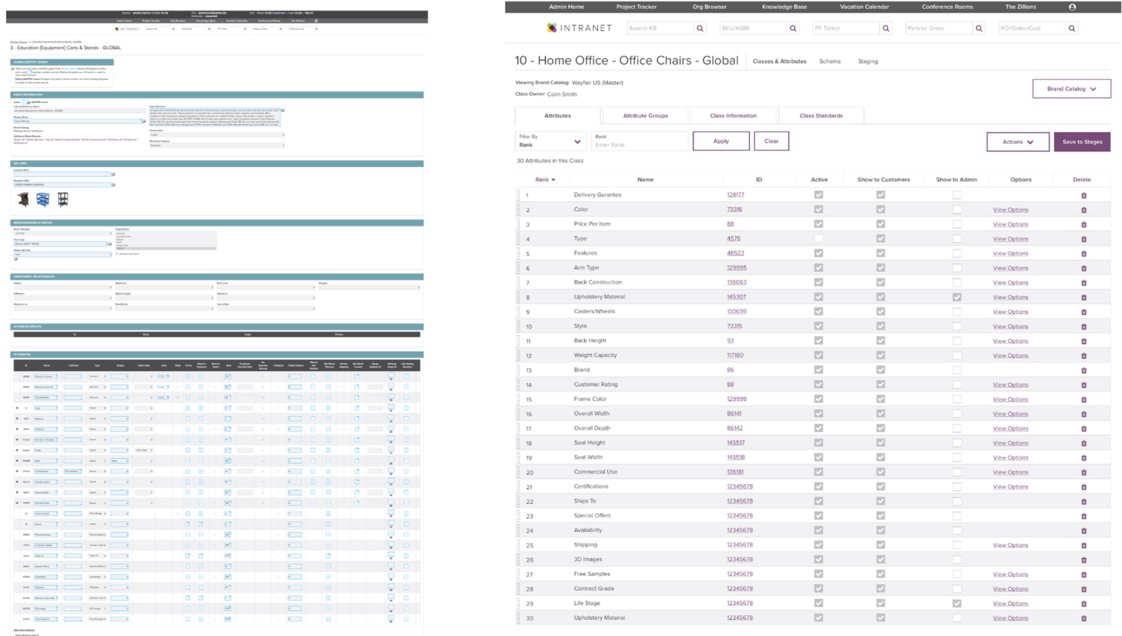
Class Hub is Wayfair’s internal content and catalog management platform, used by merchandising teams to define, manage, and operationalize product classes that directly influence site taxonomy, search relevance, and downstream merchandising workflows. The platform is one of several interconnected application suites within Wayfair’s intranet ecosystem and supports both day-to-day operations and long-term catalog strategy.
My Role
I spearheaded the end-to-end design process, from discovery through validation and delivery.
My core collaborators included:
3 Product Managers (strategy, requirements, roadmap alignment)
1 Engineering Lead (technical feasibility and delivery sequencing)
Merchandising, Media, and Supply Chain stakeholders across multiple orgs
Homebase, Wayfair’s Design Systems team, to ensure consistency and scalability
I was accountable for:
Defining the experience strategy for a complex, enterprise-grade tool
Translating ambiguous business needs into clear user workflows
Leading cross-functional design reviews and alignment conversations
Ensuring the solution scaled across roles, permissions, and use cases
Problem Space
Through early research, we identified that merchandising teams were operating within fragmented tools and inconsistent workflows, leading to confusion, duplicated effort, and reliance on tribal knowledge.
Across roles—managers, operators, and specialists—users expressed a shared need for:
Clarity: Understanding what actions were possible and where work lived
Accessibility: Reducing cognitive load for infrequent or new users
Confidence: Trusting that changes made in the system would propagate correctly across the catalog and site experience
Despite role differences, we observed a common mental model for how merchandising works: definition → review → approval → activation.
Existing tools did not reflect this reality.

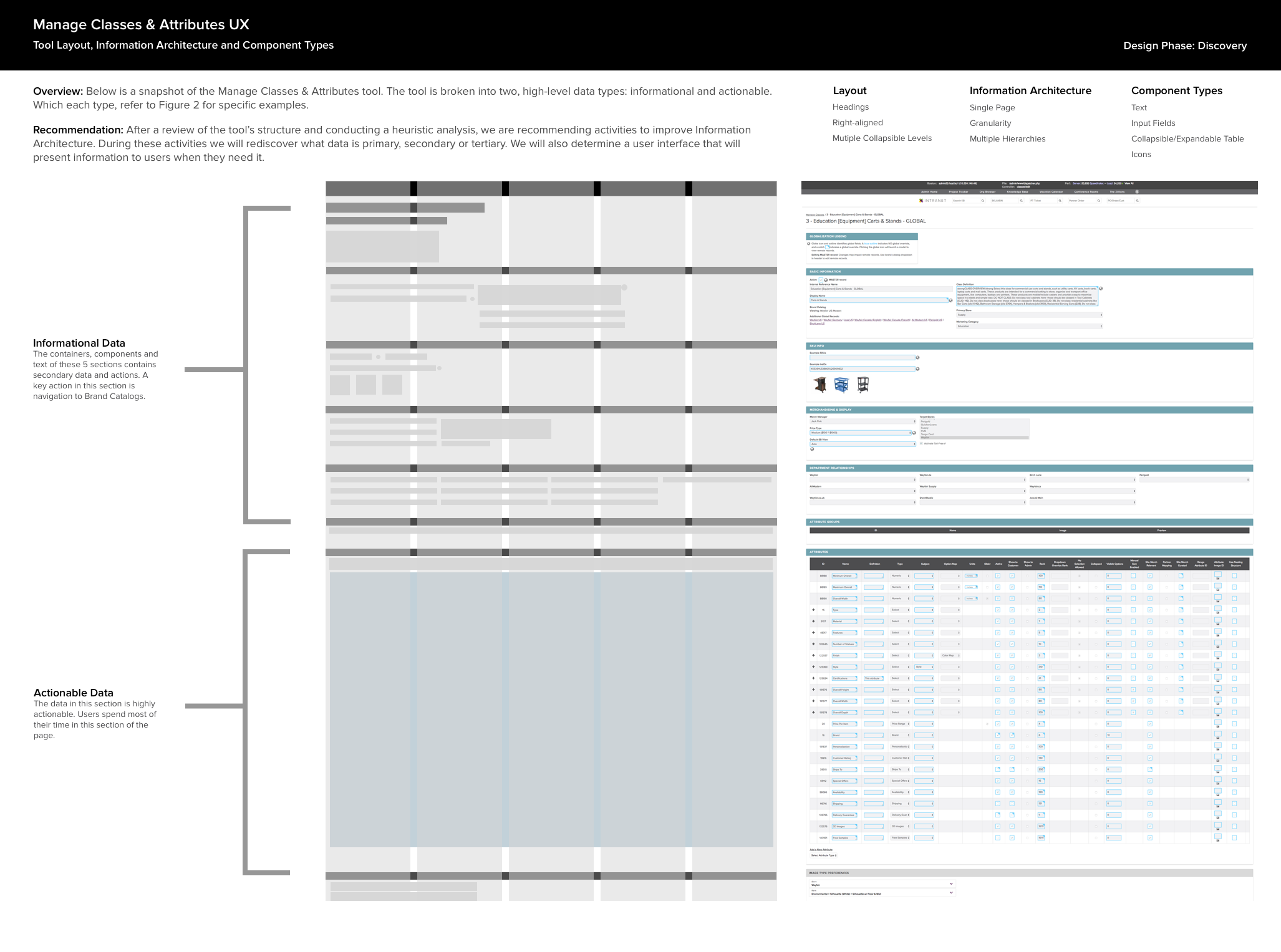
Discovery
We grounded the work in a combination of qualitative research and systems analysis, focusing on both user behavior and platform constraints.
Key activities included:
Stakeholder and user interviews across the merchandising supply chain
Card sorting and information architecture exercises
Platform and data architecture reviews
Landscape analysis of internal tools and adjacent workflows
Definition of OKRs, KPIs, and value propositions aligned to business outcomes
These efforts revealed that success depended less on visual polish and more on structural clarity, predictable navigation, and workflow alignment.
Methods Used:
Hypothesis Definition (OKR, KPI, Value Proposition)
User and Stakeholder Interviews
Platform Planning
Landscape Research
Card Sort
Data Architecture Review
Quarterly to Long View Planning
Paper Sketching
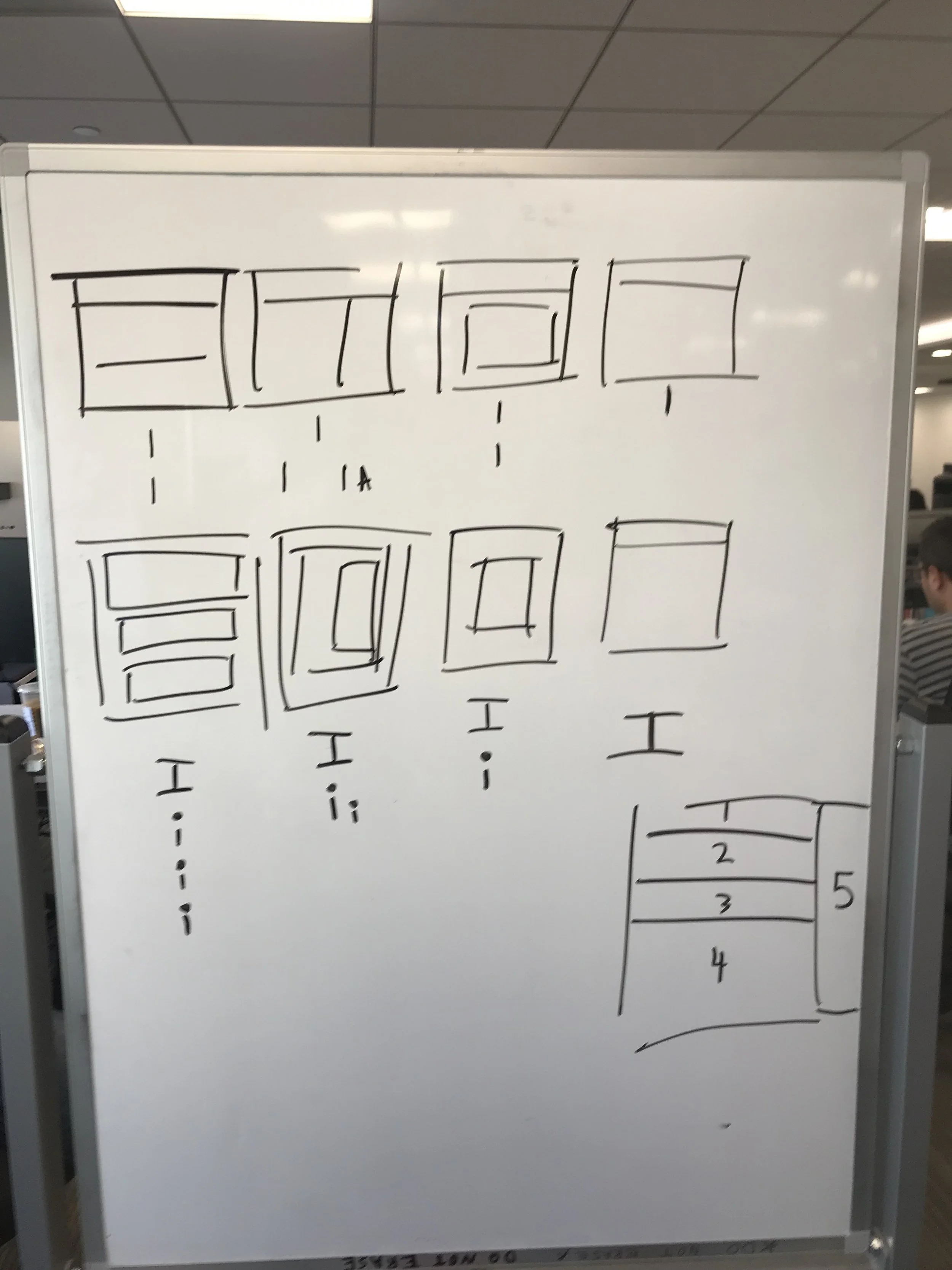
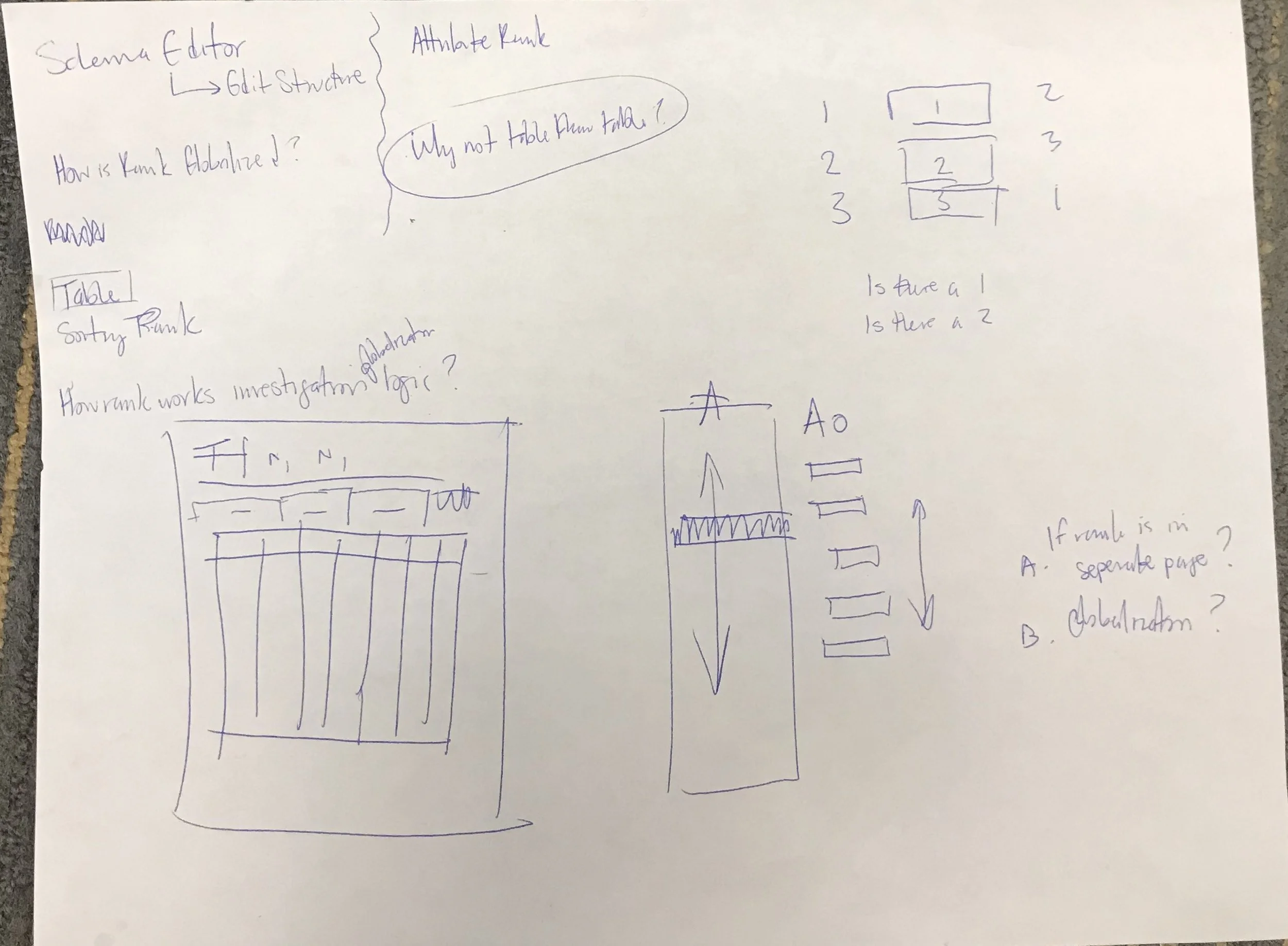
Concept exploration
During planning, I focused on progressive clarification—starting with high-level system concepts and iteratively layering detail.
Using whiteboarding, paper sketching, and design studio sessions, I:
Re-mapped navigation and task flows to match real merchandising behavior
Defined clear content groupings and page hierarchies
Established repeatable layout patterns to reduce cognitive load
Designed for role-aware workflows, anticipating different permissions and responsibilities
A key principle was that the interface should teach itself: users should understand what to do next based on layout, hierarchy, and visual affordances—without relying on documentation or training.
![[Class Hub] UI Structure Sandbox.png](https://images.squarespace-cdn.com/content/v1/59511974414fb538a0592b8a/1562516916747-7EE3S2JYD05CME1JXTC4/%5BClass+Hub%5D+UI+Structure+Sandbox.png)


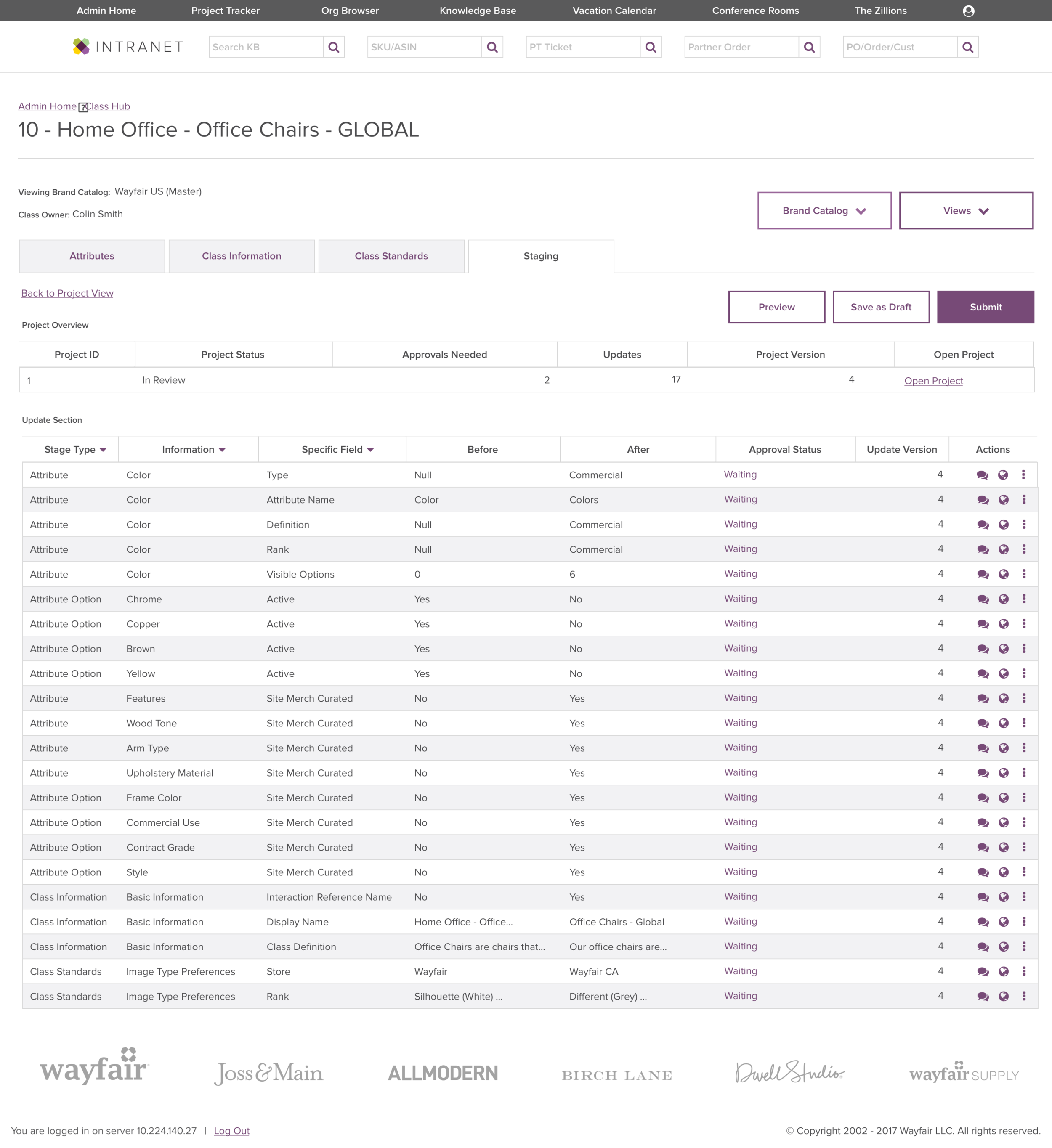


Design & Prototyping
The design phase centered on producing a high-fidelity, testable prototype that could support realistic merchandising scenarios.
I created:
Wireframes and interaction models in Sketch
Interactive prototypes in InVision
Multiple workflow variants to validate assumptions around approvals, defaults, and exception handling
Design reviews were structured to drive decisions, not feedback volume—aligning on tradeoffs, constraints, and long-term maintainability.

Usability Testing
We conducted moderated usability testing with both individual contributors and managers, reflecting the full spectrum of Class Hub users.
Participants completed scenario-based tasks while we observed:
Task completion success
Time on task
Pre- and post-task confidence
Qualitative feedback scored on a 0–5 scale
Testing surfaced actionable insights that informed refinements to:
Navigation clarity
Approval workflows
Content density and prioritization
This validation phase ensured the platform worked not only in theory, but under real operational pressure.


Outcome
The redesigned Class Hub delivered:
A clear, scalable information architecture aligned to merchandising mental models
Reduced ambiguity around ownership, status, and following actions
A foundation for future catalog and merchandising tooling within Wayfair’s enterprise ecosystem
Most importantly, the work shifted the platform from a tool users had to learn into one that reflected how they already worked, enabling faster onboarding, fewer errors, and greater confidence across teams.
