Credit Card Review Page
Overview
Problem:
High-intent users reached credit card review pages but struggled to quickly assess value, compare alternatives, and confidently act on a revenue-critical, SEO-sensitive surface.
Context:
These pages sit at the intersection of editorial trust, marketplace comparison, and affiliate conversion, making change inherently high-risk at scale.
Role:
Senior Product Designer leading problem framing, system-level design, and execution in partnership with Product and Engineering.
Result:
Shipped a scalable review template that improved decision clarity and preserved trust while enabling sustained conversion opportunities across desktop and mobile.
Business & Platform Context
Credit card review pages are one of NerdWallet’s highest-leverage surfaces:
Significant organic traffic
Strong downstream revenue impact
Strict editorial and compliance requirements
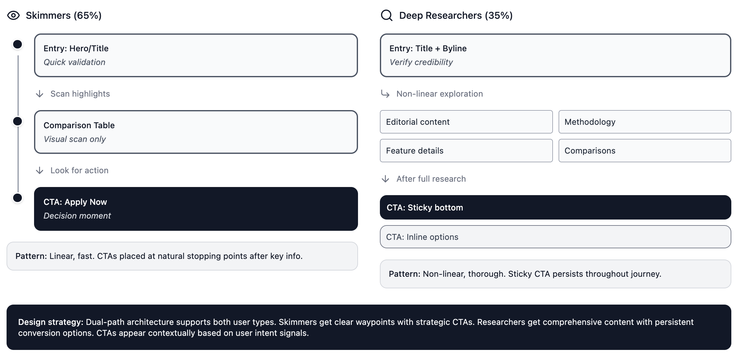
Users arrived at these pages at different decision depths, ranging from quick confirmation to deep research. The existing experience did not clearly support both behaviors, creating friction at the moment of choice.
The core risk:
Optimizing for conversion could degrade trust and SEO; preserving trust could limit monetization.
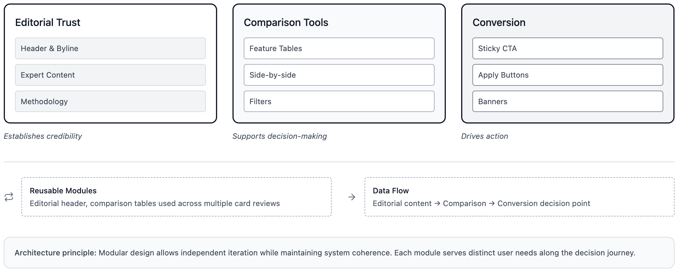
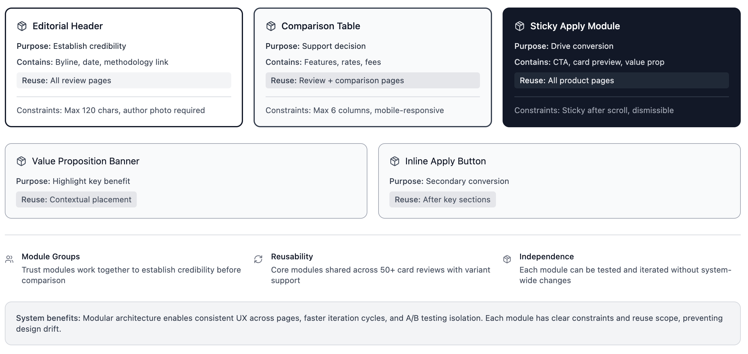
Architecture of the credit card review page showing editorial, comparison, and conversion modules. Designed as a reusable system supporting future review pages while balancing trust and monetization.
Why This Was Hard
This was a platform-level problem, not a page redesign.
Key constraints:
Structural changes could impact search rankings
Editorial credibility could not be compromised
The solution needed to scale across all future product reviews
User intent varied significantly, even within the same session
There was no single “correct” outcome, only better tradeoffs.
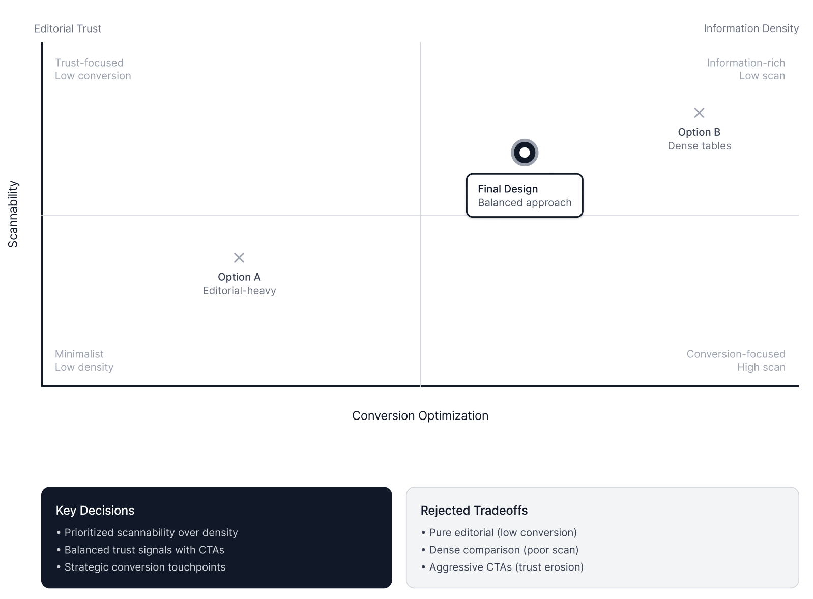
Key tradeoffs between conversion, editorial trust, scannability, and information density. Highlights the chosen approach and intentionally avoided options to manage risk and maintain credibility.
Strategy
Rather than increasing surface-level optimization, the strategy focused on decision support:
Make credibility and orientation explicit
Reduce cognitive load during comparison
Allow users to act when they are ready
The work was scoped intentionally to avoid unnecessary system risk and shipped as an A/B test.
Key Decisions & Tradeoffs
Preserve editorial authority at the top
Chose not to optimize the header for conversion
Maintained authorship, editorship, and freshness signals
Protected trust and SEO at the expense of short-term clicks
Optimize for scannability, not density
Introduced visual grouping, hierarchy, and navigation
Accepted less information above the fold
Enabled faster comprehension across varied intent levels
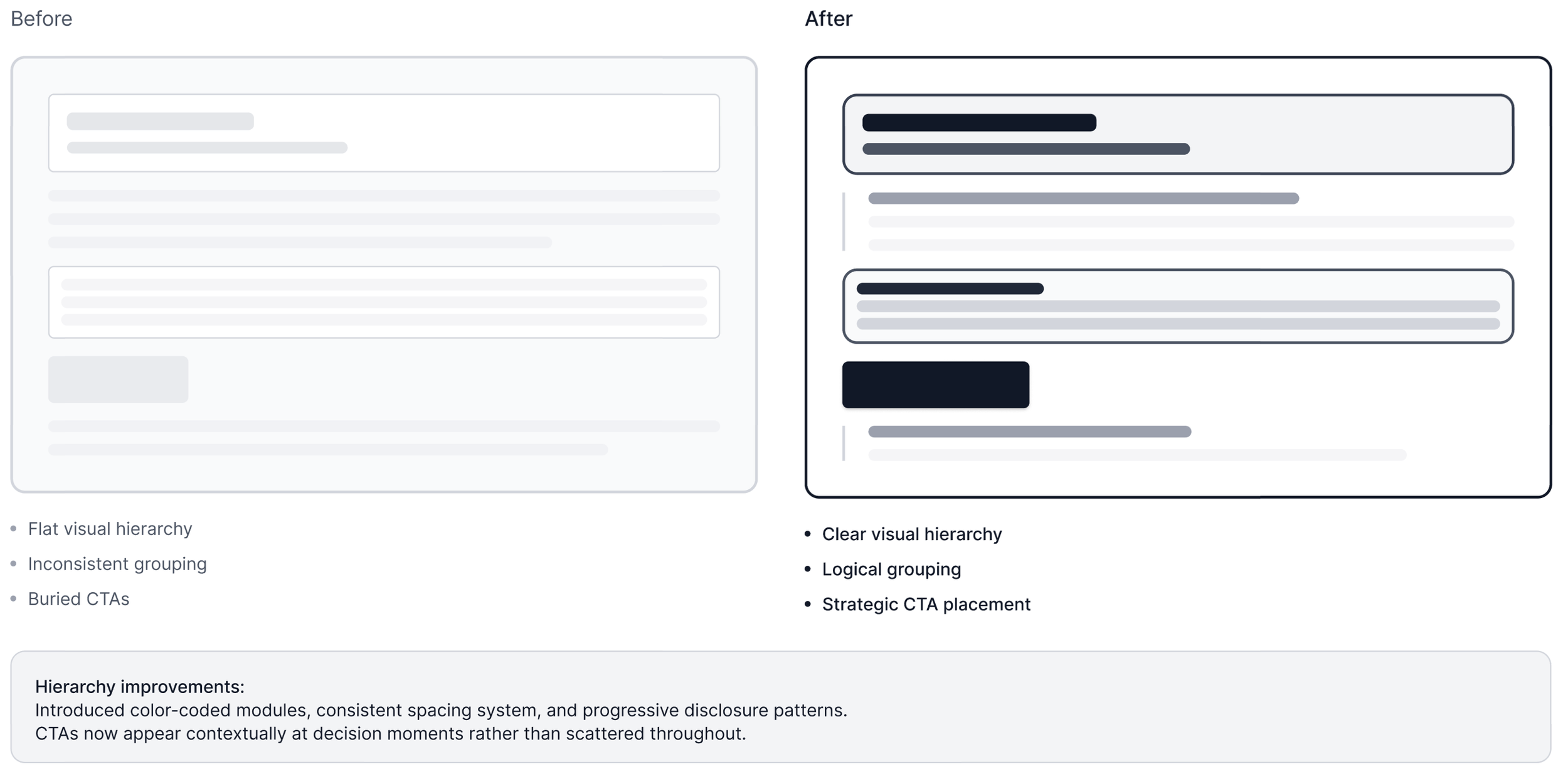
Before/after comparison emphasizing improved visual hierarchy, grouping, and navigation. Focused on reducing cognitive load for both skimmers and deep researchers.
Make conversion persistent, not intrusive
Implemented sticky and secondary application modules
Reduced urgency pressure
Aligned CTAs with real decision timing
System Design
The resulting system:
Supported linear and non-linear reading
Enabled side-by-side evaluation without leaving the page
Created a reusable template for future reviews
Balanced editorial neutrality with commercial outcomes
This was designed as infrastructure, not a one-off.
Demo
Outcomes
Improved clarity at decision moments
Maintained search performance post-launch
Reduced internal tension between editorial and product teams
Established a scalable review framework used across categories
Where metrics were directional, the primary success was risk-managed iteration on a high-impact surface.
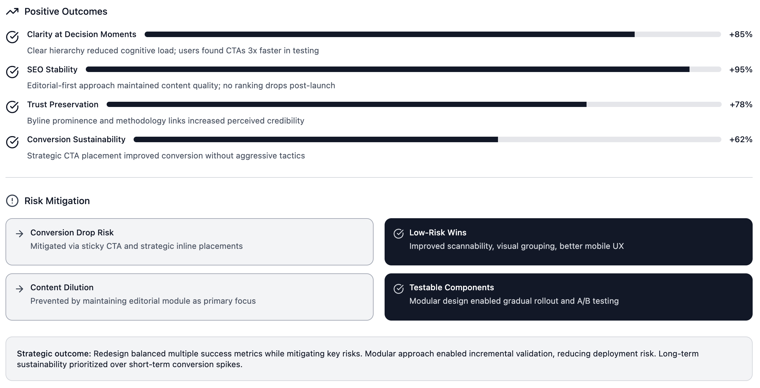
Outcomes and risks of the redesign, showing improvements in decision clarity, trust preservation, SEO stability, and conversion sustainability. Focused on safe, directional impact rather than short-term gains.
Role & Collaboration
I led this work end-to-end, partnering with:
Product on scope, guardrails, and success criteria
Engineering on feasibility and rollout
Editorial stakeholders on trust and compliance alignment
This project required senior judgment, cross-functional influence, and system-level thinking.
Appendix
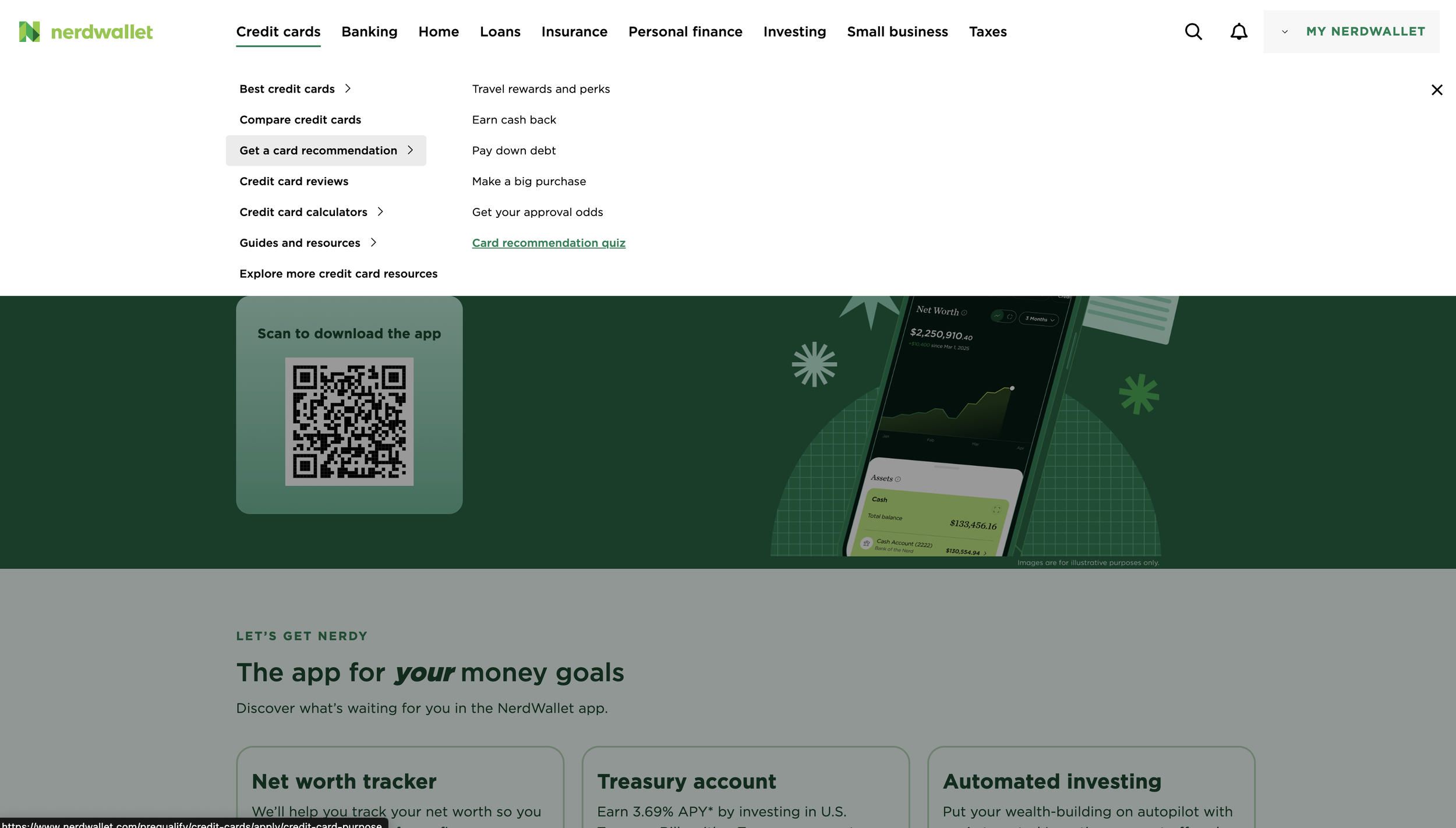
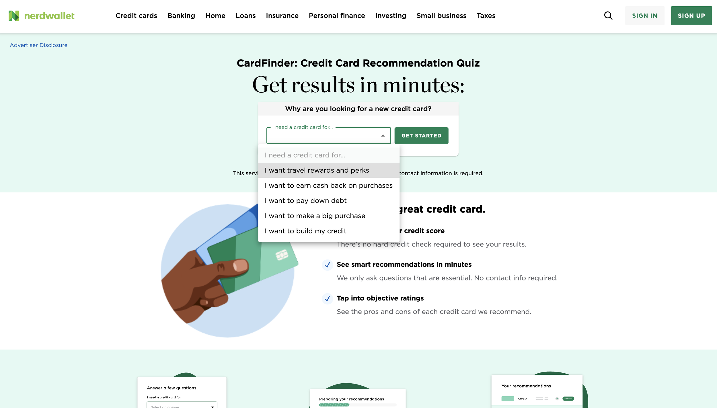
These designs show key moments: entering from navigation to the CardFinder landing page (which I designed), and the
wizard that leads to recommendations and then to a credit card review.